10.08.2009

Rain, I'mma let you finish, but....

...Hurricane Katrina was one of the worst storms ever.
How rude of you to attempt to ruin my day with too much sogginess.
Please don't wash out any roads, ok?! I want to get home tonight to watch Pam marry Jim after all this time!

9.21.2009

Small Office Perks

When you have a small office, cleaning off your desk counts as cleaning your office.

9.17.2009

I'm in Love...

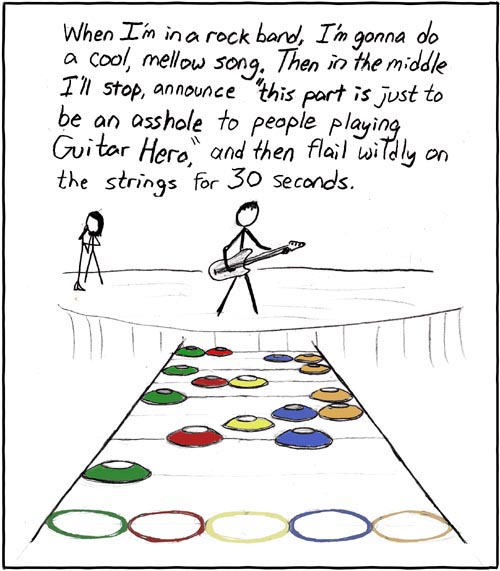
...with the new Pentagram refresh of the Guitar Hero brand marks.

Classy, powerful, WICKED!


BEFORE


AFTER


My favorite part is that the new marks are unified across platforms of play. The focus is on HERO not GUITAR, a much stronger connection visually and conceptually. Thank you for understanding that we Activision fans love to rock out on the mic or drums, too! And when you're ready to expand the brand to Marching Band Hero, I know a few folks who would quite their day jobs to help perfect it.

Proud of our AIGA brethren and can't wait to see some photography of the product research. I love how seamless the transition is from old to new marks. Not too risky but definitely a CLEAN UP JOB. Those uneven skinny and fat letters drove me up a wall! This was a killer undertaking and the final marks and logotype family are a natural fit.

"Creating the new brand language included the development of a custom font, Hero Bold, a heavyweight sans serif invested with the spiky attitude of the logotype family." - Pentagram's article (link at the top)


"Today, Activision is working with its packaging designers, as well as in-house teams and other consultants, to create other variations, including those that will be on shelves when Guitar Hero launches today, and when DJ Hero launches at the end of October and Band Hero a week later.

Project Team: Michael Bierut, partner-in-charge; Joe Marianek, designer. Hero font designed by Kai Salmela."

Bravo Michael, Joe and Kai - I extend my gnarly-nailed index finger to yours with lightning shooting out of it. You ROCK!

(Kudos to DesignersCouch blog for catching my eye with the news!)

9.11.2009

This Place Cleans Up Well


BEFORE


AFTER


After lots of trial and error with vinyl products, we found the high performance grade that stuck best. And wow does it change the feeling of this facility.
More photos here: Hold The Cheese on Flickr

Next phase is finishing file prep for vinyl application and foam sign art for concept identification at several facilities.

The new school year brought with it a greater appreciation and respect for all things student services. Event graphics production was high intensity but this "event" is crazy. You never know what you'll be asked to make!

A long, short week and I'm ready for a Big Ten football weekend.
CM

8.12.2009

When life gives you lemons...

...throw them at the salad that is peeling off the wall.


Short version of the story... giant plans to roll out beautiful new lettering in a dining facility and the specialized vinyl we chose didn't make friends with our paint. The entire order of logos and navigational lettering was ready to go, all cut and beautiful. And then, after the first application was done, the letters started to slowly wilt off the wall. Thank goodness we'd only had ONE of the many signs installed.

Quick optimism and brainstorming presented a handful of secondary solutions. We're nixing the super fancy brushed chrome effect in favor of a higher performance micro-shimmer metalic silver. Thinner vinyl = better adaptability and grip on satin finish paint. Hooray! This delays us about 2 weeks and we may not make it in time for the signs to be finished before students return to campus, but we they'll be done soon after!

Being resourceful, I salvaged the second half of "salad bar" before it was tossed. Perhaps it will surface in my new office or home mixology lab.

My brain is at ease knowing the folks who use Illustrator 9 produce quality products and think on their feet. Otherwise, I might consider the whole project an initial fail.

CM